Monday, December 24, 2012
Winter!!
So I have a winter break! This is a quick painting I did of my friends mom. He had a picture of her and I asked him if I can have it so I can paint her. Now that I think about it, that's kinda weird however he is also an art major and didn't think it was weird...I think. This is on some nice 8 x 8 watercolor paper that my roommate gave me. I don't really use watercolors too much so I painted on it with acrylic. I'm used to a smoother surface from painting on illustration board but it's a nice experiment. It requires me to load the brush more to get into all of the crevices of the paper and I usually don't mix a lot of color.
Sunday, June 3, 2012
Here are some sketches I just found after flip flopping through some sketchbooks of mine. For the acrylic city painting, one thing I realized very quickly is how often you have to change the colors when you're painting the sun going down. Without realizing it, I kept looking up and then down at my sketchbook saying "no, that's so much darker than that. what am I thinking?" As I kept going, the painting progressively got darker until I realized it's because it was actually getting darker outside. I figured that was a good place to stop, so my painting wouldn't become a big rectangle of darkness.
Monday, February 20, 2012
This is another 6x8 painting using acrylic and the rare and costly BIC ballpoint pen. I did this one in a quick hour and off it went to be hung. I added some random blue lines and dots to make it flow a bit more since the bottom was so empty. Well not empty, rather filled with a luscious sea green with a hint of washes of similar hues laying on top to give the sense of depth, as my inner art critic might say.
Saturday, February 18, 2012
I've been wanting to make a doll for a while now and the highly addictive Etsy site sparked my interest to do it. I saw that a lot of people use paper clay to make dolls, which I never used before, so I bought some. It actually says right on the package that it's ideal for doll making. It's exactly what you would think...it's clay made of paper, so it starts out kind of heavy, and when it dries, it is unbelievably light! This is what you should know about it to understand why I think it's so cool:
1) It's air drying clay. Dude, no kilns!
2) Once your object is dry and hardens (usually in 3-5 days), you can still add more wet clay on top of it
3) You can use any type of paint on it ( I know, righhhht!?)
So far, it's been really durable and there are hardly any cracks that form during the drying process. I started sculpting the head and the neck and chest piece that will secure inside the head. I still have a lot to do. Can't wait to sand down all the parts to make them extra smooth and ready for paint.
Sunday, January 8, 2012
This is a 6 x 8 inch painting that I did for a show in Beacon. I started with doing this floral pattern in the background that you see in the window next to the curtain. That was done in watercolor with those cool portable brushes with the water inside. Of course I end up changing my plan of having the floral pattern cover the whole wall. I decided to paint that purple pink color over it and I'm pretty happy with the effect because the floral pattern comes through in certain places. I put that same floral pattern on her dress and did a wash over it. Just messing around with colors. Oh and I also put a gloss medium over the black piano so it shines. Doing these smaller paintings is working out pretty well because when I paint something bigger, I plan the whole thing out and end up changing it in the process anyway.
Saturday, September 24, 2011
With toy design encompassing most of my life right now, I haven't been able to paint. When I was packing my stuff over the summer to go back to school, it was very hard to accept that I won't be needing my paints anymore for my major, but I couldn't just leave them behind. I took ultramarine, permanent rose, cadmium yellow, white, and some medium to school. Yesterday I painted some pigs and it felt great to paint again! I almost forgot how exhausting it is...but so rewarding.
Sunday, September 18, 2011
Here are two more trading card paintings I did during the summer based on old pictures I bought from the Hell's Kitchen flea market. I collaged in some scrapbook paper to make it more texturized. Small paintings like this are very enjoyable for me. It used to be just about how big I can paint something but now I have developed a liking toward small, delicate pieces.
Tuesday, August 9, 2011
Self portrait
This is a self portrait I did a few days ago. The kids I was teaching at camp had the same project, covering their paper with a wash or two, using charcoal, and glazing in some highlights. Got an urge to do one myself.
Saturday, August 6, 2011
These are three tiny paintings I did at work a few days ago. They are just random and fun and took a few minutes to make. They are on 2 x 3 inch artist trading cards. I'm going to start buying a bunch of packs because they are fun and they make it less likely for me to overwork them since they are so small. It's a good way to experiment and build up your skill without it taking hours and hours on a large canvas. I just thought of this but they're probably also good for testing out compositions before moving on to a final piece. Also, I'm proud to say all three of these sold at a donation show benefitting Arts for Healing, a program at Vassar hospital to bring arts to ill children and their families. Wooooohooo!
There will be more small works coming up!
Sunday, July 17, 2011
Illustration Friday: Gesture
I had a lot of fun with this one and it was kind of spur of the moment after receiving a graphic novel I ordered in the mail, called TELL ME, DARK. It is brilliantly illustrated by Kent Williams and it gave me the excitement to create this piece. I kept it pretty gestural and used a filed down chopstick dipped in india ink to get great line variation. I would like to experiment some more with the chopstick. It was fun!
Thursday, June 30, 2011
illustration friday: midsummer night
A few months ago, I took a bunch of random pictures on the High Line of all different people. I knew I wanted to do a painting based on one of the pictures because their gestures were great. They were sitting on a bench in the picture but I made them lay on a make-shift raft made of mattresses and fabric for the painting. I thought of putting lanterns in the sky because thousands of them were released a few days ago in Poland to celebrate midsummer. Hernan Bas was my inspiration for this painting. I really admire his paintings for their elegance and color.
Friday, June 24, 2011
amy winehouse bird
This is Amy Winehouse as a bird called the Loggerhead shrike. The bird has black around the eyes like Amy's eyeliner. Unlike the real bird, the Amy bird stores her eggs in her big hair nest. It was my first time doing jagged edges on the side. Since peeling the tape off is one of my favorite parts, it was fun to make that "ripped look" which I thought represents Amy's personality more than a straight, crisp, edge.
Thursday, June 23, 2011
Illustration Friday
Word: Launch
I took a picture of these 3 people on a bench when I was walking next to Macy's on 34th street. At first I passed them and said, "that would be an awesome picture" but I kept walking. Then, I walked back like a nerd and took a picture of them as I was walking so they wouldn't see me. I decided to incorporate the people in this painting where they are launched by a fish boat across the tropical sea with a view of cotton candy sky.
Thursday, June 2, 2011
Friday, May 27, 2011
painting sketches
I kept it kind of loose and used red, black, and white for a few of them. It's good practice using a limited color palette and you really learn how to mix many different values with just a few colors. A problem I noticed I have with my own work is sticking to just a few colors. Maybe you could say that my "style" consists of a distinct color palette, but it would also be nice to experiment with colors I don't usually use, and a limited amount of them.
Tuesday, April 5, 2011
love and the city
This is my piece for illustration process about "love and the city." I tried to make the background less detailed. I think I am finally understanding that the background of a painting should be masses of color laying next to and complementing each other. Well, actually that depends on the look you are going for. Sometimes it's nice to put small details in the background... but now I'm just confusing myself. Lately, little detail and large monochromatic areas in the background have interested me. Anyway, I think I'm getting somewhere. Time for more painting
Wednesday, March 16, 2011
powerful women
making a painting + winning $250 to Barnes and Nobles= awesome! I entered a contest on "powerful women" and thought that Michelle Obama, Oprah, Lady Gaga, and Beyonce were good representations of that....so checker out. Ever since looking at David Klein's work, especially his paintings interpreting Alice and Wonderland, I've been getting into bright, bold color and design elements. If you don't know his work, you should definitely look him up. They're mostly poster illustrations.
Thursday, January 27, 2011
candyhair
Well, this is even more different than what I usually do but I really enjoyed making this piece and want to do a series of exaggerated big-hair girls. I looked at a photo for this and just started going crazy with exaggerations and additions, that you wouldn't even think it was from the photo. This one is candyhair...which hair girl should I do next??
Saturday, January 22, 2011
something new
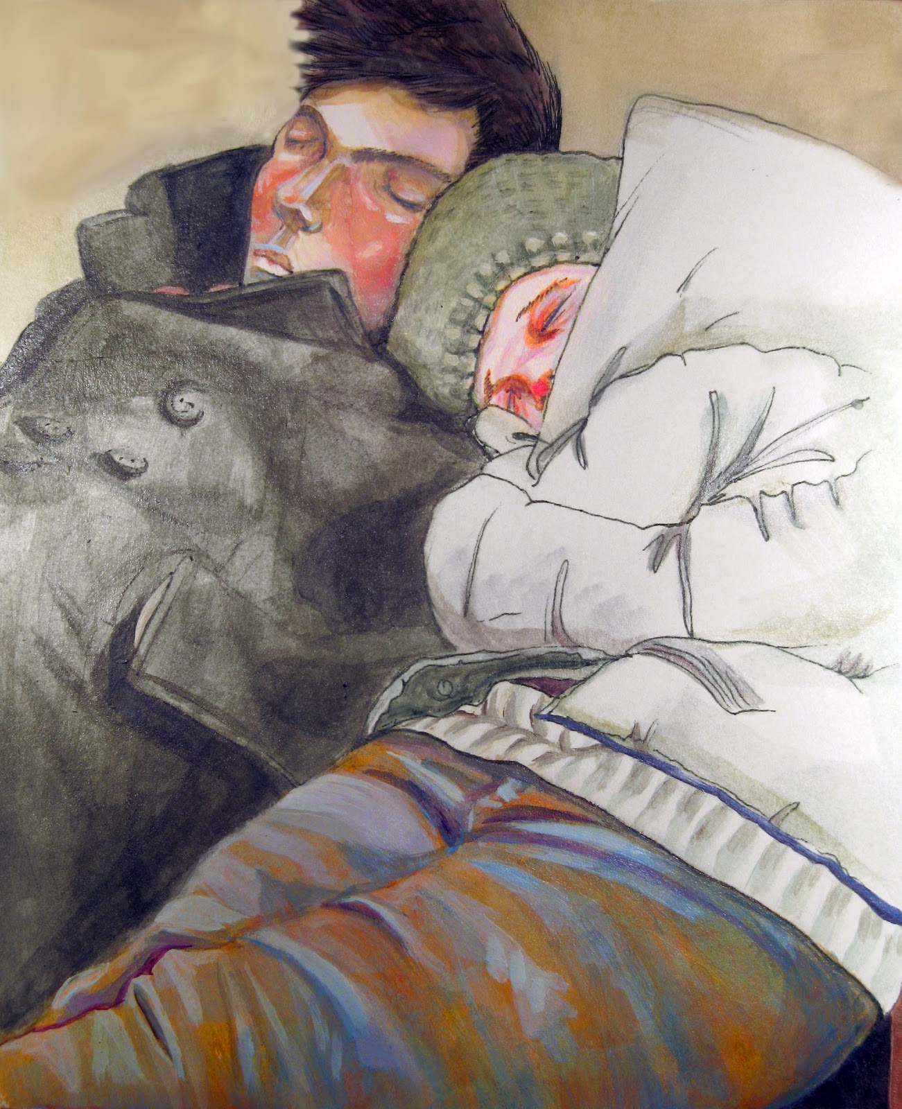
Unlike most of my other pieces, this piece is pretty small (about 6 by 7 inches). This painting only took around two hours and made me realize that working from good reference is very important. If you take your own photos with composition and all of those different elements in mind when you take the photograph, it makes the painting process much easier because much of the work is already done. From now on, I'm taking tons of pictures, even if I don't have an idea in mind for my next project. Ideas start to form when you look back at the pictures and you find special elements that you like about them. I'm also excited to take my photos and exaggerate certain things about them. Basically, it's taking one form of art(a photo) and turning it into another form of art(a painting). There would be no point of making a painting of a photo that looks exactly alike. In that case, why not just have the photo...sooooo..exaggerate to make things exciting!
Subscribe to:
Posts (Atom)